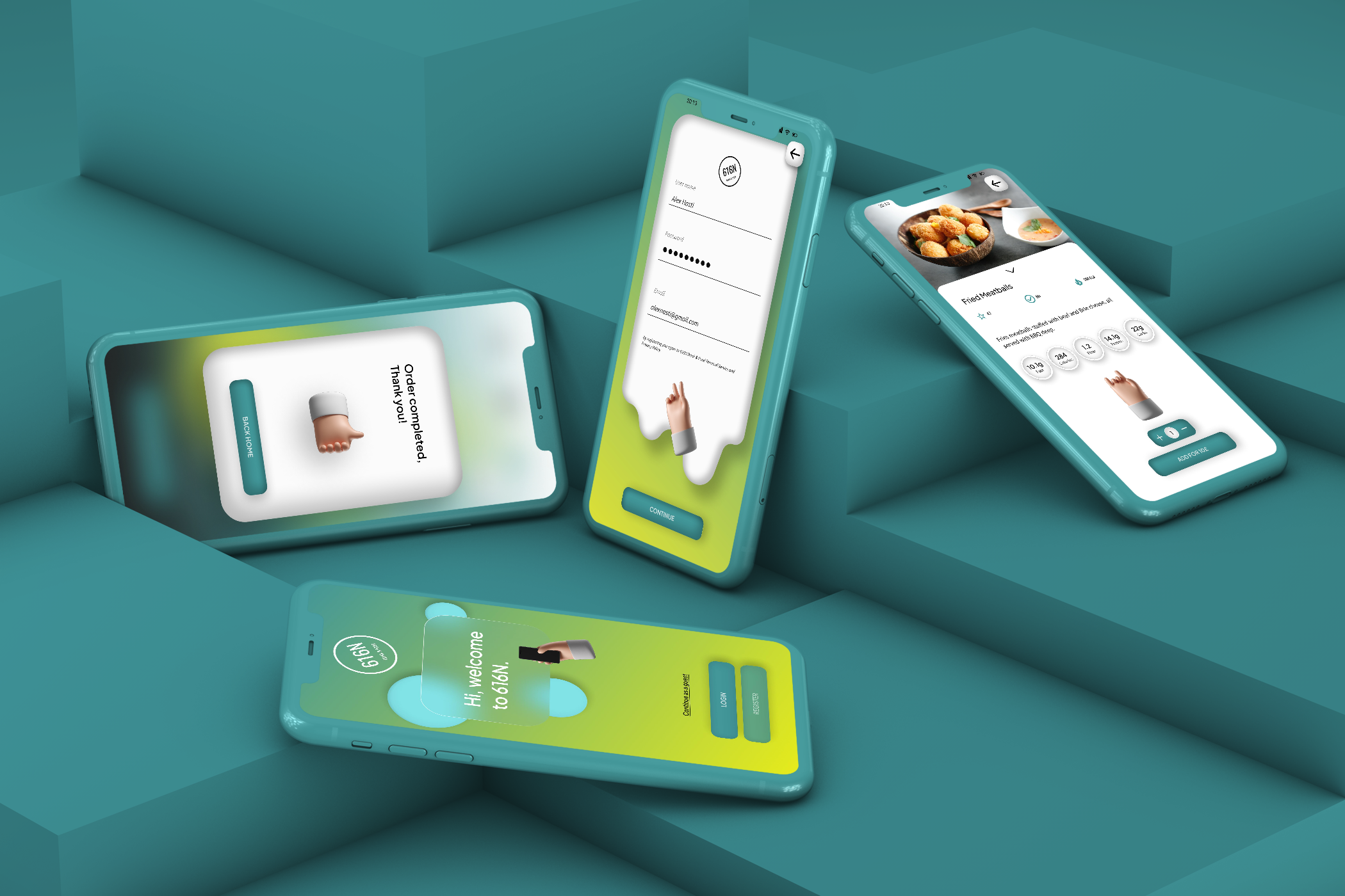
616N Drink & Food
Project: 616N Drink & Food
Role: Sole UX/ UI
Duration: June - July 2022
Project vision
616N is a local food truck app for food lovers alike. For this project Nicola decided to use a goal-directed design method which revolves around focusing on the User Interaction but also giving relevance to the persona creation and goals.
Challenges
1) Design an intuitive interface for familiar and unfamiliar users
2) Create a minimal UI while keeping products as the focus
3) Provide a simple and linear purchasing experience
4) Provide extra info about products for the users
Kick off.
In this project, I took a goal-directed approach, trying to understand the essence of the users needs, that proved to be quite effective in my design efforts. I found qualitative research methods to be the most useful, consisting in affinity maps, competitive analysis and most important my persona hyphotesis construction. I have started by asking myself some initial key questions.
What is the product and who is it for?
What do my primary users need most?
Which users are the most important to the business?
Affinity map
Possible solution iteration
Meet the users.
Primary
Name: Alex
Age: 31
Occupation: Engineer
Secondary
Name: Martina
Age: 24
Occupation: Uni Student
Competitive Analysis
I looked at several potential competing companies, some competing directly with 616N. The majority of the features between competitors were very similar, however the main differences that i have noticed were:
Easily Accessibile vs Hardly Accessibile
Too many screens vs Simplified Interaction
Specialization of Products
Preparing the journey.
I constructed a user flow of what a basic start to finish journey looks like while purchasing an item. This helps us in understading ways users can interact with the product.
Wireflow.
After sketching out some paper wireframes and thinking through the preliminary flow, I reviewed what was necessary, unecessary and what areas need improvement. I have put a lot of my time into this step to make sure I had the finishing touches on the UX before moving into the visuals.
Iteration.
After creating a prototype from low fidelity wireframes, I prepared a 10 questions survey for partcipants to fill before I began conducting a usability test. I asked 5 different participants to run through different scenarios in our prototype in hope of collecting enough feedback to use for my next set of iterations.
Challange 1
Design an intuitive interface for familiar and unfamiliar users.
A key factor is to create a design clear and simple for being understandable for all users, so one of the goals was making the app fast to scan, with basic user interactions such as carousels and instant feedback after clicking a button.
Challange 2
Create a minimal UI while keeping products as the focus.
While 616N’s primary audience is intended to be food truck lovers and often clients, those outside need to be able to use the app as well. With recognizable iconography , intuitive gestures, and a linear purchase process, I feel that 616N ha s achieved just that.
Challange 3
Provide a simple and linear purchasing experience.
With a quick and simple payment method that users can feel safe about and purchase easily every item they want to.
Challange 4
Provide extra info of the products for the users.
The UX is much more involving and satisfying when the product the user wants to buy has a descriptive feature, that allows him better understand the item he intends to purchase.
Style guide.
Combining incredibly vivid colors to create this joyful user experience, and to express how creative the 616N food truck can be. The screens feel warm and welcoming enough to draw the user further in.


Takeaways.
As a food enthusiast, 616N is a concept that I feel close to my heart. I want to communicate the importance of expressing yourself through different creative tools.


